As much as I love making little gift boxes, from time to time I make a card ... lately I choose a - sort of - mixed media style... just because I feel myself free... I can play as my soul want and my mind order. I love the disaster ( mess ) of supplies that appear from drawers up on my table, the fact that my fingers are tinted and painted and glued and so on ...LOL. It is so hard to pass from that to the mathematical state of mind making mini-boxes. But each of it has its own attraction and pleasure....
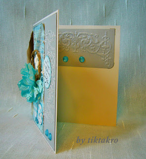
This is how this 2 year wedding anniversary card was born.
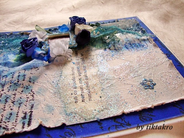
Something borrowed, something blue....

This is how this 2 year wedding anniversary card was born.
Something borrowed, something blue....

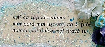
Start by playing on a piece of off-white paper, gessoed, distressed, stamped, collaged and so on . A keen eye will see everything there.
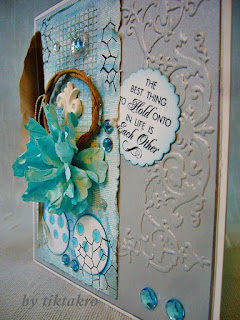
Yes, the same beloved paper flower appear ... The real feather was found in my garden. .. I love gathering feathers, twigs, little pinecones, seeds and so much more that nature offers ... I'm a this and that hoarder, I know. Two full boxes with ''things'' and so little time to play ...
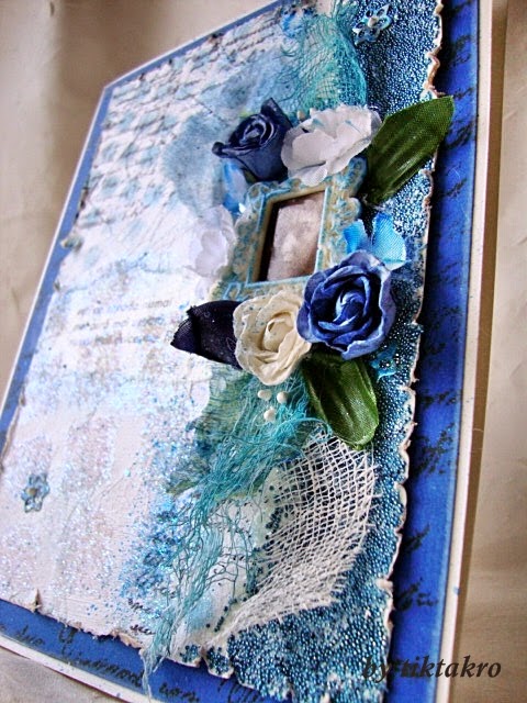
As the card has to have an elegant appearance, I used a piece of satin silver cardstock. Dry-embossed it with Brenda Walton - Florish Border and stopped. I think that a clean look worth much more . ( I had in mind some gelatos and patinas but I'm glad that I've stopped before that thought became too powerful . )

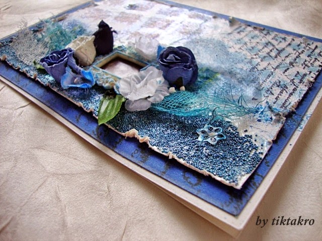
A close-up.

I think that the ''parade'' of elements is in right proportion... nothing too fancy nor too simple.
Blue and silver....may I say that I really love this combination ?


_wm.JPG)